Wardley Maps with Business Model Canvas and Capital Flows
TLDR; we talk about the business model canvas, how the Income Statements corresponds to parts of it, how both correspond to and can be shown on a Wardley Map. Based on Dr. Alistair Moore’s presentation.
Lots of work goes into making model that help us understand how, and why things work.
The questions become:
- What’s the relation between BMC, Income Statements, and Wardley Maps
- Can I move easily between them? Can I show them all using one model
- Why is there a need for moving across models or having a somewhat more general ones that incorporates the others?
On Models – just a little
As for the last question, the more models we have to represent our multifaceted reality, the better; the more visual, the better. All these tools have their place and help solve a problem. At the heart of them is that they give us a language with which we can communicate with one another.
The downside is that each comes with each language that we need to learn: income statements are the financial language; Project Management has its own; Delivery has its own; and so do Contracts Management, HR, Purchasing, Design, Marketing, Security, etc
Wouldn’t it be great, if there was one we could use that gives us a common language with which to communicate with all parts of an organization? We’ll return to this later on.
Business Model Canvas (BMC) and Income Statements
Moving between the Business Model Canvas (BMC), Income Statements, and Wardley Maps and vice-versa was part of a talk that Dr. Alistair Moore gave at Tensor Flow London 2018 – with the slides on Slideshare. Since he’s allowed me to use his images, I’ll post the most striking one here in the hope that they might pique your interest enough to seriously consider going further with Wardley Mapping.
Using the example in Simon Wardley’s online book Chapter 12 would suffice. Figure 163 even has a Business Model Canvas corresponding to the business scenario. I’m reproducing it here to avoid jumps between websites.
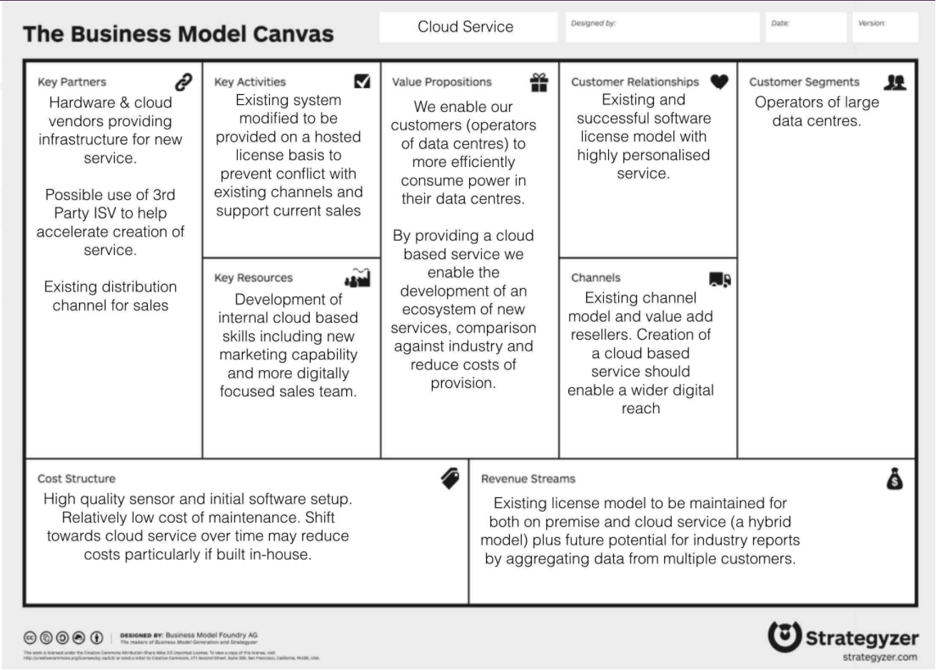 BMC for chapter 12 of Simon’s book
The BMC does not leave out those who feel at home reading Income Statements, such as those in 8-Q or 10-K fillings.
If we rotate the BMC anti-clockwise by 90 degrees, we can see how the “Revenue and Cost Structures” match the Income Statements from the 2019 10-K statement.
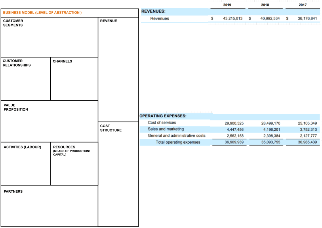 Business Model Canvas mapped to Income Statements
From Income Statement and BMC to Wardley Maps
To represent the Revenue and Cost Structure on a Wardley Map, we’d need to start with Users and User Needs because this is **the anchor** on a Wardley Map. The User and User Need translate to, in BMC terminology, to the “Customer Segments” and the “Value Proposition.” Having found that, we add an MVP or a minimum path through which Value will be delivered to the Customers.
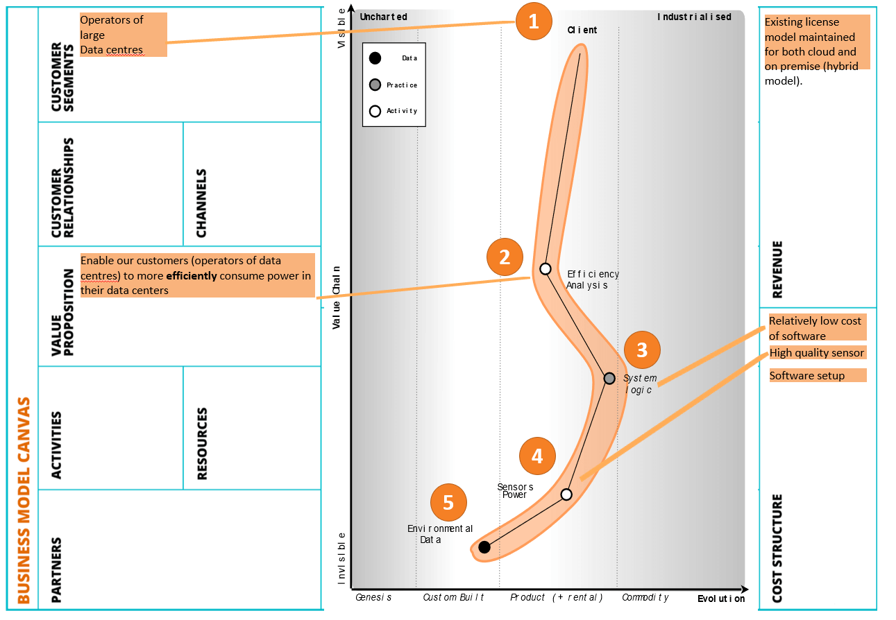 Correspondence between a Wardley Map and Business Model Canvas for a Minimum Viable Product
Read the map from top to bottom: I’ll pull in the relevant quotes from the analysis of the scenario from Chapter 13.
The Client are operators of large Date Centres.
Their need is efficiency analysis. Because the market (according to the scenario) is reasonably-sized (about 301 Million Pounds), this component would be in the “product” phase of Evolution.
”. . . I’m aware that Phoenix has some form of system logic based upon best practice use of the sensors.
“I’ve marked on the sensor logic as a practice (i.e. it seems to be connected with how we use sensors) and
the environmental data as data.”
These 5 steps form a chain of value, which is our MVP. With the diagram above, the BMC and Wardley Map are in sync.
What the BMC cannot show us is how evolved or how big the market is for an activity or a component. It’s no accident that the “System Logic” in step 3 is close to the “Commodity” phase of evolution, i.e., the market is mature. Yet, such information is hard to show within the “Cost Structure” of the BMC, never mind on the Income Statement. Knowing whether the market in which you, and all your dependencies operate, is mature or just forming or growing impacts the decisions you make as a business.
A quick reminder that if this is your first time seeing a Wardley Map, I’ll recommend a few resources at the end on getting started.
Revenue and Costs as Financial Flows in Wardley Maps
Now that we have our BMC and Map, we can go further: the Revenue and Costs in a Wardley Map are modelled as flows through the Chain.
The diagram below (also from Dr. Moore) shows the different flows of capital: when you move downwards, you pay something. When value moves upwards, you earn something.
We’ll keep the diagram simple, but also add how we’ll sell to the Client and how they’ll pay us.
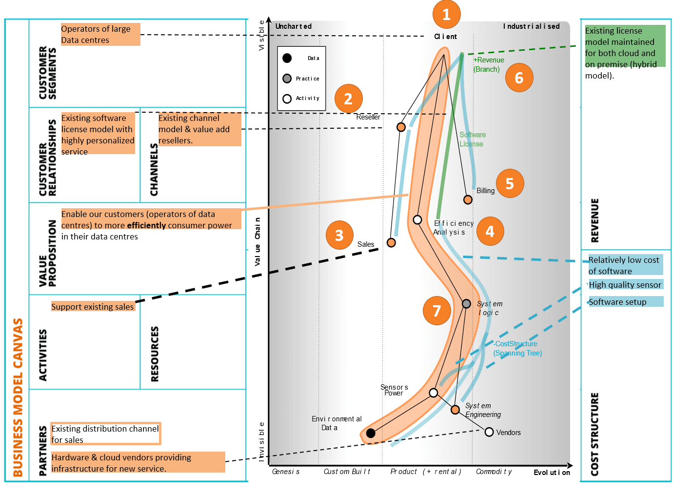 Capital Flows to Wardley Maps and their correspondence to the Business Model Canvas
Let’s go through the steps. But first these coloured flows have meaning:
- Orange is our MVP.
- Blue is Cost for us to deliver “Efficiency Analysis”.
- Green is the Revenue to us. On the map from the Client’s perspective, this would be a Cost to them (they’d use “Blue” to represent that).
Now the steps:
It always starts with the Client and their Needs.
For the Clients to get the “efficiency analysis,” they’d go through their Resellers. The Resellers might add a margin when selling to the Client. They’ll likely want us to pay them so that they continue selling our “Efficiency Analysis” product. This is also ok – cost of doing business – hence represented in “Blue”
For the Resellers to have something to sell means that we sold it to them. And that’s usually through a Sales team, thus “Blue”
The Clients gets the Analysis. They’re happy. They want to pay.
For the Client to pay us, we need to bill them. So, we’ll have a billing component. This is part of our Costs – hence “Blue”.
The Clients pays. Now, money comes in, which makes up our Revenue; hence it’s “Green”.
This underlying component is of interest to us. But the Client might not be interested in it. Or what’s underneath. As long as they have their “Efficiency Analysis,” that might be enough. But to us, it’s important because without it, we’ll not be able to deliver value to our Client.
Wardley Maps as a common language
Now that we can switch back and forth, what’s next? We’ve seen how you can show more information on a Wardley Map than a BMC because of the Y-axis – the stages of evolution that any Product or Service or Idea passes through.
With these 2 as a basis, Wardley Maps allow us to model a System or an organization in such a visual way that it’s easier for others to understand, which helps us with communicating just as geographical maps do.The more we understand maps, the more we can represent on them. We can show Practices, Data, Knowledge on these maps. We’ve seen how to visualize movement of capital as flows.
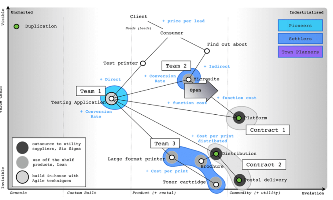 Wardley Map overlaid with Doctrine and Climatic Patterns
Once the above map is understood, it also works as a Management Tool.
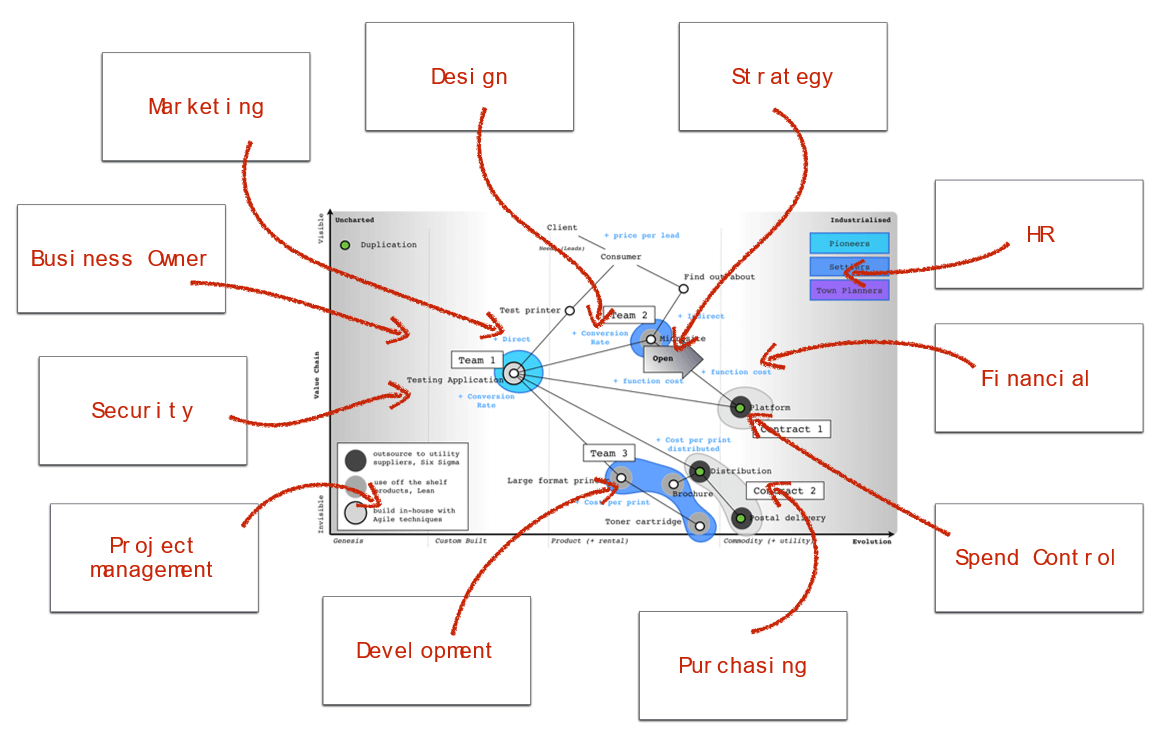 Wardley Map as communication tool for all departments
It’s with difficulty (or somewhat impossible) to depict such a huge amount of information on one graphic. Yet, this graphic, this map enables everyone from the different departments to communicate with each other using a common language. Making decisions of where to focus on or which direction to take are open to all to participate in.
I’ll leave you with what Yodit Stanton left us with at MapCamp 2019
